
“The way the state defines ‘disadvantaged’ is often unfair and inaccurate. In Manhattan, Hudson Yards and much of the High Line are considered disadvantaged, unlike many communities of color in Queens.
Michael Appleton/Mayor’s Photographic Office
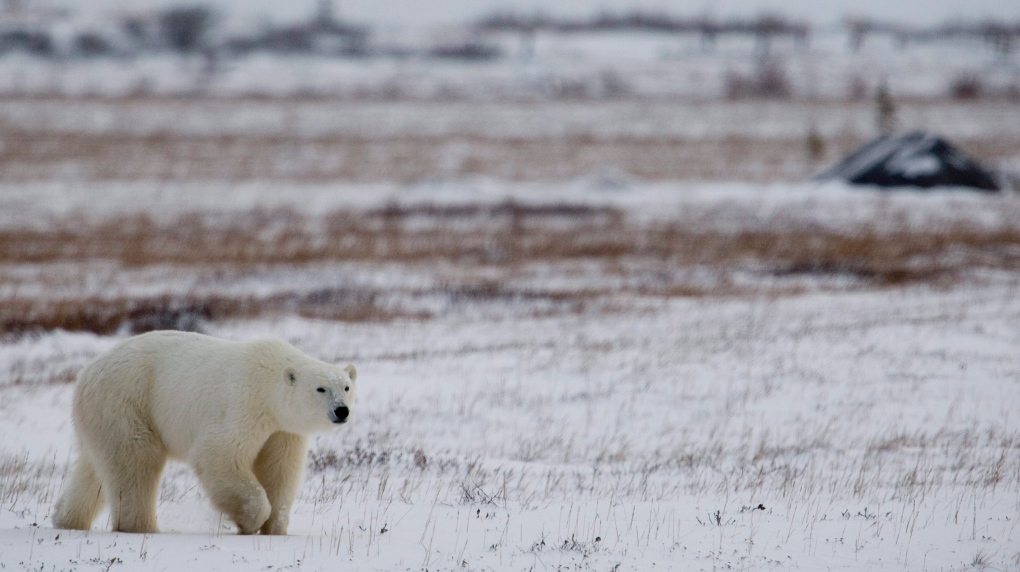
Flood damage in Woodside, Queens from Hurricane Ida in 2021.
When it comes to climate change and its disastrous effects in New York, which households and communities are most vulnerable?
Under the 2019 Climate Leadership and Community Protection Act (CLCPA), the State must drastically reduce greenhouse gas emissions by 2050, with “disadvantaged communities” receiving at least 35% of the investments of the 300 billion dollars required for the green transition. This provision has made New York the national leader in climate justice and demonstrates the state’s commitment to increasing the resilience of New Yorkers who are most susceptible to climate change due to factors such as racism, poverty and proximity to industrial sites. Affected benefits, including green jobs and community-owned solar power, will also serve as reparations for ongoing environmental damage.
But the way the state defines the “disadvantaged” is often unfair and inaccurate. In Manhattan, Hudson Yards and much of the High Line are considered disadvantaged, unlike many communities of color in Queens.
These discrepancies are not limited to the five boroughs: Baldwin Harbor in Nassau County has large black and Latinx populations and is at high risk of coastal flooding, but is not designated as disadvantaged. By contrast, some affluent and segregated white communities on Long Island qualify under the current system as disadvantaged because they neighbor marginalized communities of color, including Shinnecock Tribal Nation territory in the Hamptons.
New Yorkers now have the opportunity – and the responsibility – to help the state move towards real climate justice by submit our contribution (in person, virtually or in writing) about these community designations. Public participation has so far been abysmal: only four people testified at the in-person hearing in New York on June 14. But it’s not too late: the comment period is open until July 7th.
In 2020, New York hired out-of-state consultants to create the current map of disadvantaged communities using a data-driven model. Each of the state’s 4,919 census tracts received a numerical score based on its relative performance on 45 combined variables, such as air quality and racial demographics. The top-rated areas were designated disadvantaged.
Overall, the State’s strategy favors statistics on lived experiences. Although the consultants spoke with the Climate Justice Working Group (CJWG), which approved the draft map, the state limited the number of activist members of the CJWG. As a result, many vulnerable communities were not given a voice in the map development process.
Unfortunately, the census tract approach makes household misclassification inevitable, erasing differences within densely populated areas, such as those gentrifying in New York City.
Elsewhere, the map splits cohesive neighborhoods, designating only disadvantaged portions. In South Ozone Park, a sewage backup flooded nine blocks in a working-class community of color in 2019. Three census tracts converge on these blocks, and the draft map codifies only one as disadvantaged. Among the excluded areas, one borders two freeways that are major sources of air pollution: the Belt Parkway and the Van Wyck Expressway.
The data on which the state model is based can also be misleading. It is understandable that the current formula treats the risk of coastal flooding and adjacency to remediation industrial sites (such as brownfields) as indicators of disadvantage. However, as my colleague Melissa Checker, professor at Queens College points out that such indicators have labeled hotspots of post-industrial waterfront development, including Hudson Yards, as disadvantaged.
Unfortunately, at least one of the model’s datasets appears to be inaccurate. During Hurricane Ida last September, an Indo-Trinidadian mother and son drowned in their basement apartment on 183rd Street in Hollis. During the same storm, a Nepalese family of three, including a two-year-old boy, drowned in another basement apartment in 64th Street in Woodside. And yet, census tracts in these two blocks scored in the 0 percentile for “inland flood risk areas.” Neither is considered disadvantaged.
Finally, the 45 variables are insufficient and do not measure community disadvantage, including the impact of the airport. Although located adjacent to John F. Kennedy International Airport, most census tracts of Brookville, Laurelton, Rosedale, and Springfield Gardens are not classified as deprived. Barbara Brown, president of the Eastern Queens Alliance (EQA), said all areas near the airport should be included due to the constant air and noise pollution from low-flying planes that regularly rattle the homes of the region. Community members have to contend with 18-wheel diesel trucks that support next-day deliveries and off-airport warehouses. Residents of these areas are predominantly black and fall between the 93rd and 100th percentile for low birth weight in the state.
Last November, the consultants acknowledged major flaws in the draft map when they reported that 48% of New York’s low-income households did not live in “disadvantaged” census tracts. The CJWG then decided to complete the map by classifying all households earning less than 60% of the state median income (SMI) as disadvantaged, regardless of location.
This is an important, but limited, solution to the problems of the Map Project in the New York area. It allows more people to access individual benefits, such as subsidies for electrical appliances, but not neighborhood improvements resulting from geographic investments, such as improved public transport. This intervention also does not help many inhabitants of the metropolitan area who make more than 60% of the SMI ($32,748 for a single person; $62,988 for a family of four), but are still struggling financially due to our high cost of living. Moreover, sociologists like Thomas M. Schapiro establish that disparities in wealth – not just income – explain racial inequality in the United States.
Given the discrepancies between the draft map and the first-hand knowledge of many New Yorkers, it is imperative that more of us review and, if necessary, refute the current version through public comment. An interactive map project, with disadvantaged communities in purple, shows how your neighborhood and others have fared. Start by entering a postal code in the search field at the top left of the map. When you click on a census tract, you can see its performance on all 45 indicators.
State officials need our help to achieve climate justice.
Natalie Bump Vena is an Assistant Professor in the Department of Urban Studies at CUNY Queens College.